The theme toggle, an empty vanity
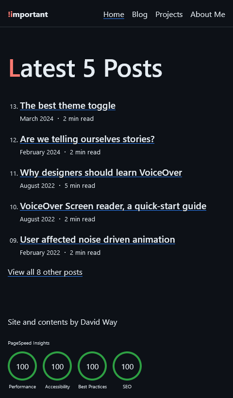
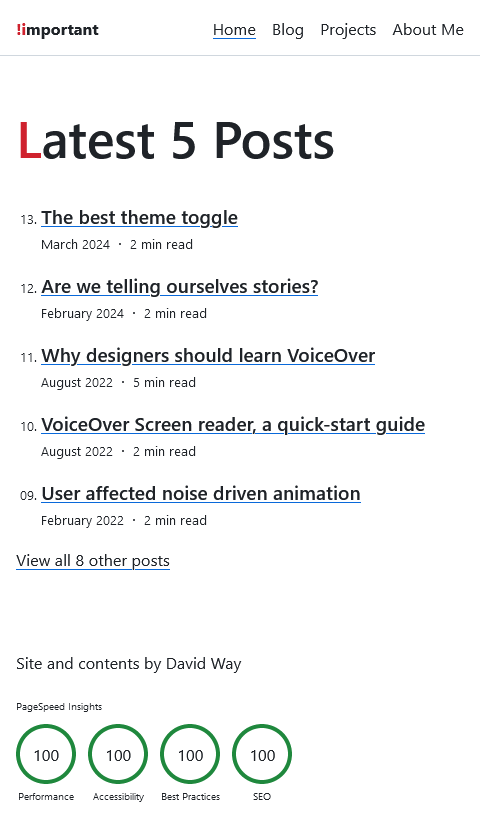
TLDR: This site has a darklight theme, but it doesn't have a dark/light mode toggle or a theme selector because your browser/device already has one.
The primary goal for this site was to force myself to write more. I always enjoy having written, but I rarely enjoy the act of writing itself.
One of the more enjoyable aspects of having this site is having a place to tinker with things and explore ideas. Sometimes that enjoyment becomes a "productive" distraction from that primary goal.
A darklight theme one of the first things I implemented for this site.
But before adding a feature for a features sake I asked myself the following two questions:
- Should you provide a darklight mode?
- Should I add a theme toggle control?


Question 1: Should you provide a darklight mode? #
A dark color scheme can reduce eye strain, especially in low-light environments, can extend battery life (for certain OLED display types), and some users find dark mode visually appealing and modern.
Light mode has been the standard for a long time, and many users are accustomed to it, so it has become an expected feature.
Light mode is generally more readable in well-lit environments. A Human Factors study suggests light mode enhances the legibility of text, and as a result, the reading comprehension and proofreading performance of the reader. Light backgrounds can also be more conducive to displaying accurate colors in some scenarios.
Neither dark or light mode is objectively superior; each has its merits and pitfalls that depend on individual preferences and other factors out of your control. The most responsible course of action is obviously to offer both a light and dark mode and let the user decide.
Once I was finished implementing the darklight mode, I'm slightly embarrassed to say, I was excited to work on a cool toggle switch.
Question 2: Should I add a theme toggle control? #
My first intuition was that the answer to this question would be an obvious "yes". In an effort to honestly evaluate the feature, what follows are the best reasons I could come up with.
-
Appeal of Novelty: Because it will be fun (think of all the time we can spend tweaking the easing curve on an elaborate sun into moon animation) 🤓
-
Optimism bias: Because it's easy. Once you have the theme designed and implemented in CSS Custom properties, the code to implement switching between modes using a toggle is trivial
-
Bandwagon effect: Because everyone has one (someone even built a beautiful site dedicated to cataloging common theme toggle types)
-
Vanity: Because I put all this effort into supporting a darklight mode, not every site has one, so why not make it discoverable and easily accessible?
Less than convincing. Perhaps you can think of better reasons or perhaps I should have asked a more open question. A question like "How should the user select a theme?".
This is a better question as it opens up the mind to lateral possibilities, diverging from the narrow focus of a solution. The next thought came easier.
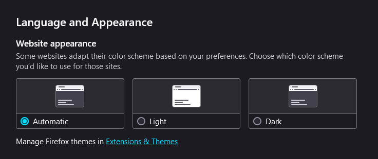
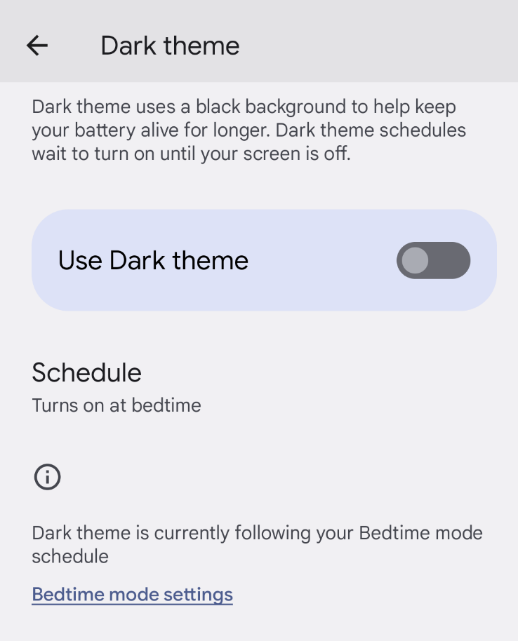
Users already have a global and robust way to define their preferred theme and browsers do a good job of honoring the application of these preferences!

These controls work system-wide/device-wide, often at the Operating System level (where the user can set it once) and at a per-application level where users can automatically adjust their preferred theme based on conditions like the time of day or ambient light conditions.

From a theming perspective, there is nothing unique enough about this site. Nothing that I should have any reason to think it would be an exception to how a visitor would normally prefer to consume their content. Users spend most of their time on other websites, so they expect your site to work like all the other sites they already know. It's also reasonable for them to expect those sites to honor configuration decisions they have already made.
Adding a theme toggle to the page adds design redundancy at the cost of complicating a simple feature. It's also an extra tab stop for keyboard/screen reader users and an additional eye fixation as well as extra code to maintain.
…[Perfection is achieved] not when there is nothing left to add, but when there is nothing left to take away.
Maybe, some users will never discover and beam in wonder at the exceptional darklight theme I toiled away on (a noble sacrifice on my part).
But maybe, the best theme toggle is the one the user already has.